Background: You work for a company that recently implemented new customer service protocols. Customer satisfaction data was collected at three time points: before the change (Q1), and at two follow-up periods (Q2, Q3). Customers rated their satisfaction with service quality and product value on a 1-5 scale. Each row represents one customer’s ratings across all three quarters.
Import data
Download the file customer_satisfaction.csvand place it in your working directory. Import the CSV file and store it in a variable called customers_data.
Prepare data
The data is currently in a wide format - each quarter is a separate column. Transform it to a tidy format where: - One column indicates the quarter (q1, q2, q3) - One column indicates the metric type (service_quality, product_value) - One column contains the rating value
TipHint: how to separate columns
Compute grouped averages
Calculate the mean rating for each combination of quarter and metric type. Store this in a new table called satisfaction_summary.
Visualization
Create a line plot showing how average customer satisfaction changes over quarters. It should have the quarters on the x-axis, the mean rating on the y-axis, and it should show different colors for service quality and product value.
Bonus: compute improvements
Solution
For this exercise we need the following packages:
library(readr)library(dplyr)
Attaching package: 'dplyr'
The following objects are masked from 'package:stats':

    filter, lag
The following objects are masked from 'package:base':

    intersect, setdiff, setequal, union
library(tidyr)library(ggplot2)library(kableExtra) # <- only for the presentation on the webpage
Attaching package: 'kableExtra'
The following object is masked from 'package:dplyr':

    group_rows
Since the csv file is in good shape we can just read it via data.table::fread() or, because it is already very clean, with readr::read_csv():
# Note: adjust to you project and best use here::here()customers_data <-read_csv(file ="Recap8b/customer_satisfaction.csv")
Rows: 50 Columns: 8
── Column specification ────────────────────────────────────────────────────────
Delimiter: ","
dbl (8): customer_id, account_age_months, q1_service_quality, q1_product_val...

ℹ Use `spec()` to retrieve the full column specification for this data.
ℹ Specify the column types or set `show_col_types = FALSE` to quiet this message.
This is how the current data looks like:
head(customers_data) |>kable()
customer_id
account_age_months
q1_service_quality
q1_product_value
q2_service_quality
q2_product_value
q3_service_quality
q3_product_value
1
12
3
5
4
2
5
3
2
25
4
1
4
4
5
3
3
34
4
5
2
3
5
5
4
20
1
5
5
5
3
5
5
16
3
1
2
5
5
5
6
13
5
1
5
4
4
4
To transform it into the desired long format we use tidyr::pivot_longer(). Here we can make our live easier by using the selection helper dplyr::starts_with() to capture all columns starting with q. But a simple application only brings us that far:
The column name still contains information about both the quarter and the metric. There are a number of ways we can separate this column.
One way would be to use the argument names_sep of pivot_longer() and then give two column names to names_to. This works in our case but note that it gives a warning that some parts of the column are dropped:
This is because we are telling the function to separate the column using the token _, but this token appears more than once (but we only provide two column names). In our case this is save to ignore, but when you want to avoid it, you can use the function dplyr::separate(), which allows for more sophisticate separation procedures. In our case, we can set extra = "merge", which tells the function to only split on the first underscore and keep everything else together:
customers_long <- customers_data |>pivot_longer(cols =starts_with("q"),names_to ="full_name",values_to ="rating" ) |>separate(col = full_name, into =c("quarter", "metric"), sep ="_", extra ="merge")head(customers_long) |>kable()
customer_id
account_age_months
quarter
metric
rating
1
12
q1
service_quality
3
1
12
q1
product_value
5
1
12
q2
service_quality
4
1
12
q2
product_value
2
1
12
q3
service_quality
5
1
12
q3
product_value
3
Next we need to compute average ratings for each combination of quarter and metric type:
Note: there are different ways of doing this. Instead of the more explicit group_by() you could have used summarize(..., .by=c()).
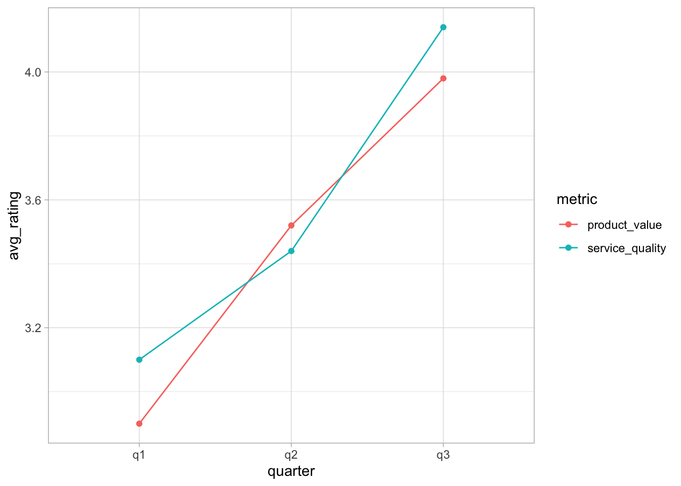
The final step is then to create the visualization using ggplot2. The only thing to note is that we need to be explicit regarding the grouping and set
ggplot(data = satisfaction_summary, mapping =aes(x = quarter, y = avg_rating, colour = metric, group = metric) ) +geom_point() +geom_line() +theme_light()
TipWhy do we need group = metric?
When you use geom_line(), ggplot2 needs to know which points to connect. By default, ggplot2 automatically creates groups based on the combination of all discrete variables in your data. In our case these are the two variables quarter and metric.
So ggplot2 creates groups based on the combination of both these variables:
q1 + product_value (1 point)
q1 + service_quality (1 point)
q2 + product_value (1 point)
q2 + service_quality (1 point)
q3 + product_value (1 point)
q3 + service_quality (1 point)
Each group has only one observation, so there’s nothing to connect with a line!
What we actually want is to have separate lines for each metric, i.e. one line for product_value across all quarters and one line for service_quality across all quarters.
So you need to tell ggplot2: “Group by metric only, not by the combination of all discrete variables, which would be quarter and metric!”
Of course, there are many ways to make the plot pretties, but here we may leave it at this!
To also complete the bonus challenge, we need to compute the improvement after the intervention, i.e. from q1 to the other two quarters. We will do this by computer the average for q2 and q3, compute the relative change to q1 and then rank the data according to their relative changes.
Here are all steps conducted separately: first, create a new variable to group periods before and after the intervention: